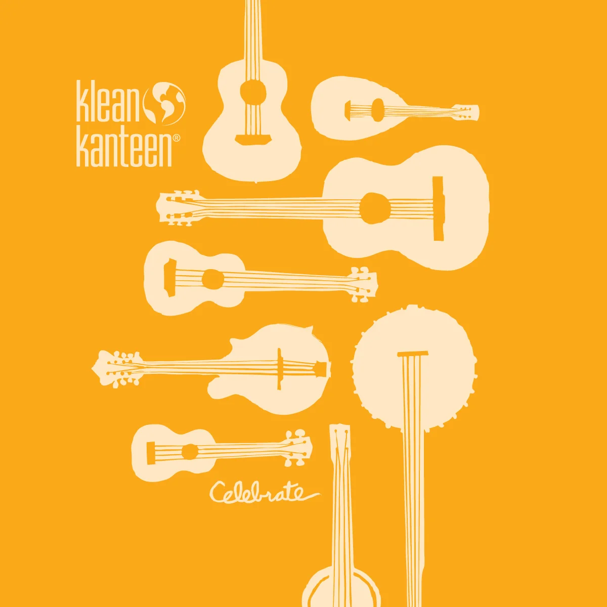
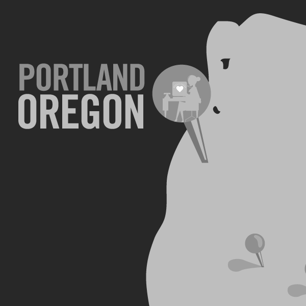
This special edition set of Klean Kanteen stainless steel water bottles are designed to celebrate our close ties to the natural world. Custom packaging and product illustrations were designed in collaboration with a team at Stickeen in Portland, OR.
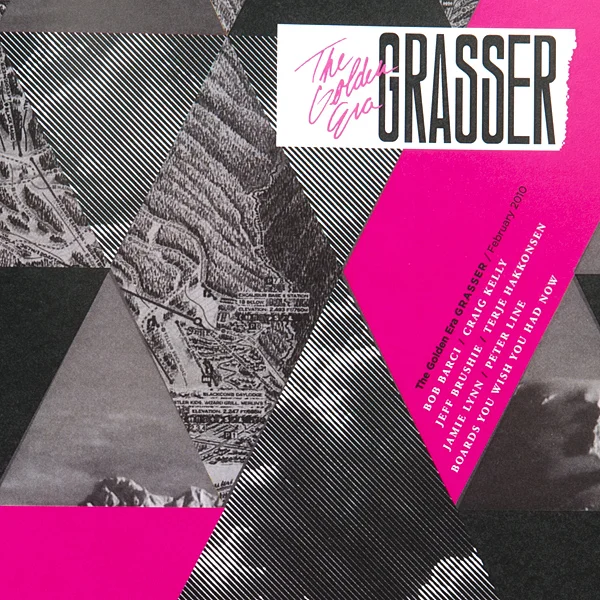
Grasser Mag
Grasser Mag is a quarterly publication highlighting stories from the golden age of snowboarding. The magazine showcases content from one of snowboarding's rich decades (1987 - 1997) to intrigue and educate riders from a younger generation. A variety of illustration styles, colorful layouts, and fun typographic treatments re-energize old stories and memories from snowboarding’s past.
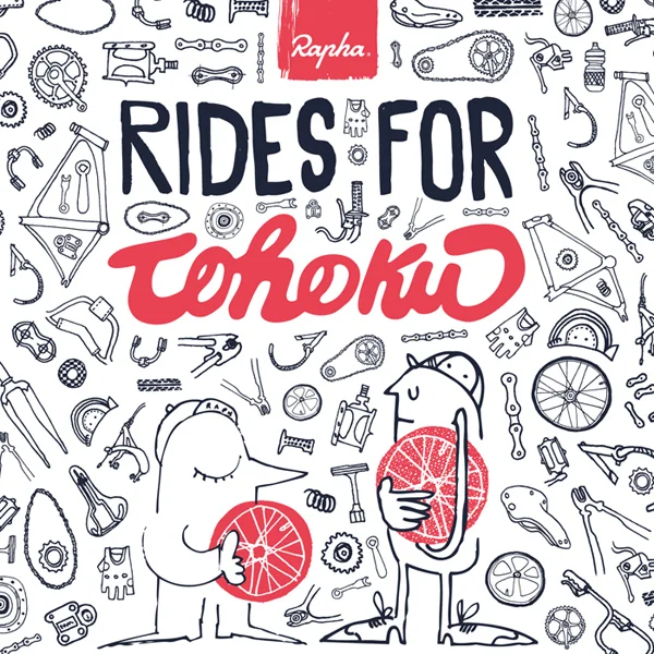
Rapha Rides for Tohoku
Rapha Rides for Tohoku is a worldwide charity bike ride for the victims of the earthquake and tsunami disaster in Tohoku, Japan, 2011. For the last four years Rapha Japan, based in Nagano, has shared stories and rides with the world to communicate just how beautiful and fascinating the country is. Various bicycle part and character illustrations communicate the fun and history of cycling in this campaign.
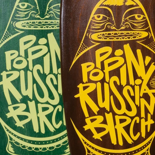
Poppin Russian Birch
Bana Board makes custom vintage Russian Birch skateboard decks. The Poppin’ Russian Birch illustration was created for their new line of birch wood banana boards.
Vizify VizCards
Illustration and color palettes were designed for Vizify's bite-size VizCards, a tool to quickly communicate your personality through pictograms. The user can collect VizCards to quickly communicate the traits that make them unique.
Shapes in Motion
Shapes in Motion is a short motion graphic animation exploring simple shapes and how they can interact with a fast paced song.
Logos
This is a collection of logos and brand identities for various clients. These marks showcase a versatility of aesthetics and style using simplicity, heritage, monograms, custom lettering and type, consistent Brand ID sets, and geometric design.
Volume Bikes
This is a collection of t-shirt designs for Volume Bikes that explore a variety of illustration and typographic styles to appeal to the brands line of apparel for the season.
People Towels
This is a contest entry design to be featured on a sustainable cloth People Towel. The design uses elements of nature and typographic statements related to living a sustainable lifestyle. People Towels is an on-the-go alternative to paper towels. They're reusable personal hand towels with printed designs.
The Shaky Hands
The Shaky Hands are a Portland based indie rock band, distinct for their sound and highly sought after promotional t-shirt designs and cdʼs. Promotional pieces including a poster, concert ticket, postcard and cd package were designed for their hometown venue at Stumptown Coffee Roasters. The illustrations have the character of Portland's coffee culture. The characters and band logo are versatile elements for multiple venues.
Ruby Receptionists
Ruby Receptionists are a cheerful team of virtual receptionists with offices based in Portland, Oregon. This is a 1 minute motion graphic / animation to quickly highlight their story and services for use on the home page of their website. Storyboards, illustrations, and animations were designed and collaberated on with a team at Sockeye in Portland, Oregon.
Demolition Forks
This is a design for Chris Doyle's signature Demolition Parts fork line.
The Life Aquatic
This is a title sequence for the movie Life Aquatic. It uses texture and camera pans to explore a fun construction paper environment of jacques cousteau's boat the Calypso.
Child's Play Charity
Child’s Play is a video game community and charity that donates to childrens’ hospitals around the world. This poster design will ship to their current donator’s and urge them to donate for a second time. The design taps into a relatable nostalgia for their target audience, using late 80s and early 90s gaming culture as the platform for content and illustrations.
Lacie Rugged
Lacie Rugged is a line of mobile hard drives that are reliable and durable for the designer on the go. The new package design cuts dead air space and can be reused for archiving your physical Rugged drive. The clean and bright simple color palette is printed with soy inks on 100% Neenah recyclable paper to achieve a sustainable solution without losing beauty and durability.
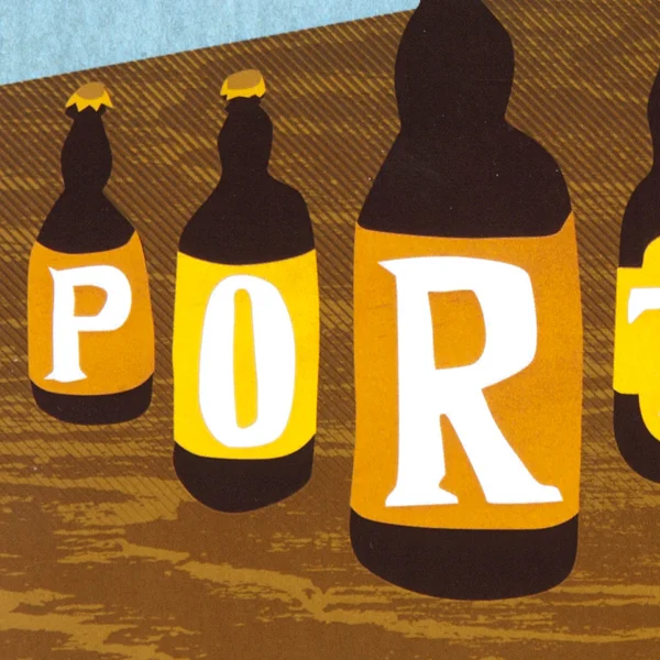
The Art Institute of Portland
The portfolio show at The Art Institute of Portland needs to bring in creative industry employer’s to view the student’s work upon graduation. The postcard takes Portland’s craft beer brewing culture and relates it to the student’s design and craft at The Art Institute of Portland.
The Black Keys
This motion graphics piece focuses on kinetic type and illustrations. The subject is The Black Key’s song Kid Sinister. One verse of the song is used to show the various motions of typography and shape. The piece uses texture, bold type, and textured imagery to make a cohesive blend style and motion.